How to Create a Responsive Navbar Using Material UI and React Router
Damilola Adedoyin Ezekiel
24 Aug 2021
•
5 min read

The navigation bar is one of the most vital aspects of building an app. It tells users about the information and actions relating to the current screen. It is very easy to create a navigation bar in React using Material UI as there's already a component made for these and this component is called "App bar".
In this article, we will be looking at how to create a responsive navigation bar using the Material UI component and adapt it to different screen sizes.
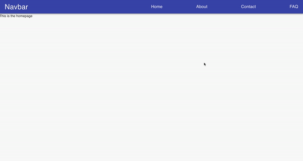
At the end of this article, our end result should look like this:
Step 1 : Set-Up
- Create a new react app by running the command below in your terminal
npx create-react-app navigation-bar //
or
yarn create-react-app navigation-bar
Step 2: Install dependencies
The next step is to install the material UI library and also react-router-dom.
npm install @material-ui/core
npm install @material-ui/icons
npm install react-router-dom
or
yarn install @material-ui/core
yarn install @material-ui/icons
yarn install react-router-dom
Step 3: Create a basic header component
-
Create a new component folder in src, then create a file and name it navbar.js.
-
Import App, Toolbar as these are the basic material UI components for creating a navbar, also Cssbaseline as this will help remove margins and them makeStyles for styling.
-
Import Link from react-router-dom as this is what will be used for routing.
import React from "react";
import {
  AppBar,
  Toolbar,
  CssBaseline,
  Typography,
  makeStyles,
} from "@material-ui/core";
import { Link } from "react-router-dom";

const useStyles = makeStyles((theme) => ({
  navlinks: {
    marginLeft: theme.spacing(10),
    display: "flex",
  },
 logo: {
    flexGrow: "1",
    cursor: "pointer",
  },
  link: {
    textDecoration: "none",
    color: "white",
    fontSize: "20px",
    marginLeft: theme.spacing(20),
    "&:hover": {
      color: "yellow",
      borderBottom: "1px solid white",
    },
  },
}));

function Navbar() {
  const classes = useStyles();

  return (
    <AppBar position="static">
      <CssBaseline />
      <Toolbar>
        <Typography variant="h4" className={classes.logo}>
          Navbar
        </Typography>
          <div className={classes.navlinks}>
            <Link to="/" className={classes.link}>
              Home
            </Link>
            <Link to="/about" className={classes.link}>
              About
            </Link>
            <Link to="/contact" className={classes.link}>
              Contact
            </Link>
            <Link to="/faq" className={classes.link}>
              FAQ
            </Link>
          </div>
      </Toolbar>
    </AppBar>
  );
}
export default Navbar;
- Import the Navbar component into App.js and you should see the result above.
Step 4: Routing
-
Import Router, Switch, and Route from react-router-dom in App.js
-
Create an App function that returns a Router component. Inside the Router component is where all the routing will take place.
import React from "react";
import { BrowserRouter as Router, Switch, Route } from "react-router-dom";
import Navbar from "./component/Navbar";
import Home from "./pages/home";
import About from "./pages/about";
import Contact from "./pages/contact";
import Faq from "./pages/faq";

function App() {
  return (
    <Router>
      <Navbar />
      <Switch>
        <Route exact path="/" component={Home} />
        <Route path="/about" component={About} />
        <Route path="/contact" component={Contact} />
        <Route path="/faq" component={Faq} />
      </Switch>
    </Router>
  );
}
export default App;
- After doing this, our app should be routed from one page to another.
Step 5: Create a Drawer component.
Drawer is a material UI component that gives access to supplementary contents on a page. It can be anchored from the Top, Bottom, Left, and Right, that is our Drawer can be displayed on any part of the page and this can be done by passing a prop called anchor and setting it to either Top, Bottom, Left, and Right.
-
Create a Drawer.js file in the component folder and in that file, create a DrawerComponent function.
-
Import Drawer from Material UI, then create a function named DrawerComponent which will return a Drawer and a ListItem and this is where we will place the list of items we want in our responsive navigation bar.
import React, { useState } from "react";
import {
  Drawer,
  List,
  ListItem,
  ListItemText,
} from "@material-ui/core";
import { Link } from "react-router-dom";

function DrawerComponent() {
  return (
    <>
      <Drawer>
        <List>
         <ListItem>
            <ListItemText>
              <Link to="/">Home</Link>
            </ListItemText>
          </ListItem>
          <ListItem>
            <ListItemText>
              <Link to="/about">About</Link>
            </ListItemText>
          </ListItem>
          <ListItem>
            <ListItemText>
              <Link to="/contact">Contact</Link>
            </ListItemText>
          </ListItem>
          <ListItem >
            <ListItemText>
              <Link to="/about">Faq</Link>
            </ListItemText>
          </ListItem>
        </List>
      </Drawer>
  );
}
export default DrawerComponent;
- After doing this, we now create a hook that allows us to use state on the drawer component, that is will be displayed when there is an action to call it. We will set a state called openDrawer and the setter function will be called setOpenDrawer and then we will set useState to false because we only want the drawer to be displayed after calling it.
const [openDrawer, setOpenDrawer] = useState(false);
- We will then pass the state as a prop to the Drawer component. From the API documentation of Drawer in Material UI, there are some default props that comes with it. We will be using the onClose and open prop. The openDrawer state will be assigned to open Prop and the setter function will be assigned to the onClose prop.
<Drawer open={openDrawer} onClose={() => setOpenDrawer(false)} >
We will also repeat the same process for the ListItems. The setter function will be passed to an onClick Prop and it will be set to false. What this does is that, whenever any of the items is clicked the drawer will close.
<ListItem onClick={() => setOpenDrawer(false)}>
      <ListItemText>
            <Link to="/about">About</Link>
       </ListItemText>
  </ListItem>
- Finally, we will import an Icon from the material UI and this Icon will be used to toggle the drawer state. Whenever we click on this icon, It opens and closes the drawer.
import IconButton from"@material-ui/core";
import MenuIcon from "@material-ui/icons/Menu";

 <IconButton onClick={() => setOpenDrawer(!openDrawer)}>
        <MenuIcon />
 </IconButton>
Our Final output should look like the code below.
import React, { useState } from "react";
import {
  Drawer,
  IconButton,
  List,
  ListItem,
  ListItemText,
 makeStyles
} from "@material-ui/core";
import { Link } from "react-router-dom";

const useStyles = makeStyles(()=>({
    link:{
        textDecoration:"none",
        color: "blue",
        fontSize: "20px",
    },
    icon:{
        color: "white"
    }
}));

function DrawerComponent() {
const classes = useStyles();
  const [openDrawer, setOpenDrawer] = useState(false);
  return (
    <>
      <Drawer
        open={openDrawer}
        onClose={() => setOpenDrawer(false)}
      >
        <List>
         <ListItem onClick={() => setOpenDrawer(false)}>
            <ListItemText>
              <Link to="/">Home</Link>
            </ListItemText>
          </ListItem>
          <ListItem onClick={() => setOpenDrawer(false)}>
            <ListItemText>
              <Link to="/about">About</Link>
            </ListItemText>
          </ListItem>
          <ListItem onClick={() => setOpenDrawer(false)}>
            <ListItemText>
              <Link to="/contact">Contact</Link>
            </ListItemText>
          </ListItem>
          <ListItem onClick={() => setOpenDrawer(false)}>
            <ListItemText>
              <Link to="/about">Faq</Link>
            </ListItemText>
          </ListItem>
        </List>
      </Drawer>
      <IconButton onClick={() => setOpenDrawer(!openDrawer)}>
        <MenuIcon />
      </IconButton>
    </>
  );
}
export default DrawerComponent;
Step 6: Adding It together.
This is the final part where we combine both the navigation bar and the Drawer together in order to make it responsive.
-
import the Drawer component into the Navbar component.
-
import useTheme and useMediaQuery from Material UI and this is because we will be using material UI breakpoints and we cannot do that without using Material UI's theme. We will set theme to useTheme() function and then we will declare a variable called isMobile( call it any name) to useMediaQuery and then we will be able to use Material UI's breakpoints. This was explained in the previous article on material UI styling.
 const theme = useTheme();
 const isMobile = useMediaQuery(theme.breakpoints.down("md"));
- We will now use our isMobile Variable in a ternary statement and this will check if our screen size is equal to the breakpoint declared above then it should display the DrawerComponent else it should display the regular navigation bar.
{isMobile ? (
          <DrawerComponent />
        ) : (
          <div className={classes.navlinks}>
            <Link to="/" className={classes.link}>
              Home
            </Link>
            <Link to="/about" className={classes.link}>
              About
            </Link>
            <Link to="/contact" className={classes.link}>
              Contact
            </Link>
            <Link to="/faq" className={classes.link}>
              FAQ
            </Link>
          </div>
        )}
Our final code should look like the demo below.
import React from "react";
import {
  AppBar,
  Toolbar,
  CssBaseline,
  Typography,
  makeStyles,
  useTheme,
  useMediaQuery,
} from "@material-ui/core";
import { Link } from "react-router-dom";
import DrawerComponent from "./Drawer";

const useStyles = makeStyles((theme) => ({
  navlinks: {
    marginLeft: theme.spacing(5),
    display: "flex",
  },
  logo: {
    flexGrow: "1",
    cursor: "pointer",
  },
  link: {
    textDecoration: "none",
    color: "white",
    fontSize: "20px",
    marginLeft: theme.spacing(20),
    "&:hover": {
      color: "yellow",
      borderBottom: "1px solid white",
    },
  },
}));

function Navbar() {
  const classes = useStyles();
  const theme = useTheme();
  const isMobile = useMediaQuery(theme.breakpoints.down("md"));

  return (
    <AppBar position="static">
      <CssBaseline />
      <Toolbar>
        <Typography variant="h4" className={classes.logo}>
          Navbar

        </Typography>
        {isMobile ? (
          <DrawerComponent />
        ) : (
          <div className={classes.navlinks}>
            <Link to="/" className={classes.link}>
              Home
            </Link>
            <Link to="/about" className={classes.link}>
              About
            </Link>
            <Link to="/contact" className={classes.link}>
              Contact
            </Link>
            <Link to="/faq" className={classes.link}>
              FAQ
            </Link>
          </div>
        )}
      </Toolbar>
    </AppBar>
  );
}
export default Navbar;
Conclusion
There are a lot of approaches to creating a navigation bar with Material UI, but the method we've just gone through is very easy and straightforward. You can customize and style the navigation bar to match whatever you're trying to achieve.
Here's a link to the complete demo
Thanks for reading!!!!!

WorksHub
Jobs
Locations
Articles
Ground Floor, Verse Building, 18 Brunswick Place, London, N1 6DZ
108 E 16th Street, New York, NY 10003
Subscribe to our newsletter
Join over 111,000 others and get access to exclusive content, job opportunities and more!